I run. I also built an app that visualises air quality. So a question had been nagging at me: on the days the air is worse, do I actually run worse — or do I just feel like I do?
It seemed like the kind of thing you could just check. I have years of runs sitting in Strava, each one stamped with a date, a pace, a heart rate. And historical air-quality data is free. So one weekend I pulled all of it and tried to answer the question honestly — which, it turns out, mostly means trying very hard not to fool myself.
Here's what I found, why my first answer was almost certainly wrong, and what the real answer says about whether this is worth anyone building on.
The setup
I exported my entire Strava history — about 500 runs going back to 2014 — and matched each run to the air quality at that place and time using Open-Meteo's historical air-quality data (the same source that powers Polly).
A few decisions mattered a lot:
- One city, one era. I moved countries a couple of years ago, and the reliable air-quality history only goes back to ~2022 anyway. So I narrowed to runs around my current home, Bern, from 2022 on. I used the GPS in each file to drop travel runs — a marathon in another city would otherwise get matched to the wrong air.
- A fair measure of "performance." Raw pace is useless: a hilly run is slower for reasons that have nothing to do with the air. So I used grade-adjusted pace (what my pace would have been on the flat) and, separately, cardiac cost (how many heartbeats each kilometre cost me — a fitness signal that's harder to fake).
- Easy runs only. I threw out races and interval sessions, because effort is a huge confound. If I happen to do my hard workouts on clear days, that alone would invent an "air effect" out of thin air.
Then the important part: I didn't just correlate pollution with pace. I built a regression that holds the confounders constant — temperature, humidity, distance, hills, how much I'd run in the previous week and month, and a slow fitness trend over time. The question isn't "am I slower on polluted days." It's "am I slower on polluted days once you account for everything else that was also going on."
My first answer was a clean "no"
Here's the headline chart. Each dot is one easy run. The horizontal axis is my recent PM2.5 exposure after stripping out every confounder above; the vertical axis is grade-adjusted pace, with slower runs higher up.
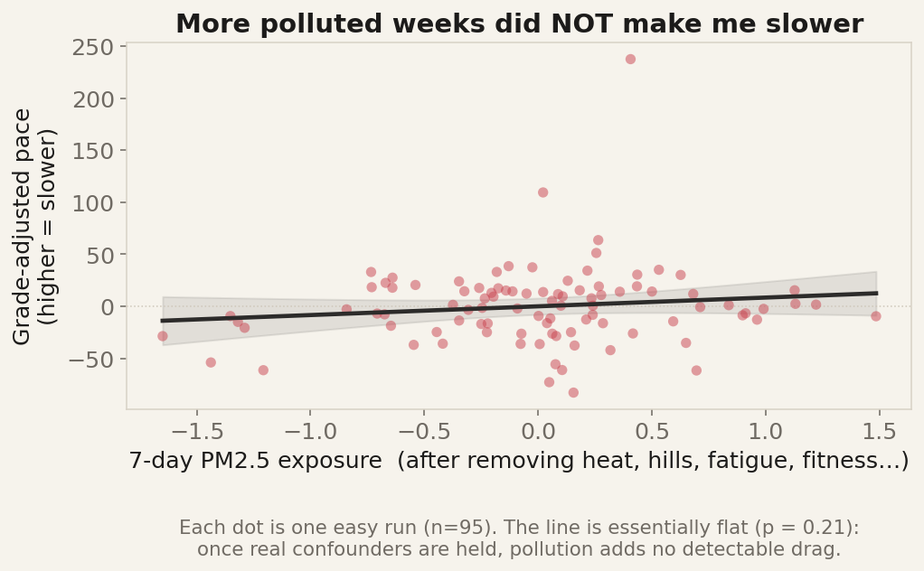
The line is flat. Not "weakly positive," not "trending" — flat, with a confidence band that comfortably straddles zero (p ≈ 0.2). Higher pollution in the days before a run was not associated with me running slower. Same story for ozone, and for longer 21-day exposure windows.
So: case closed, air quality doesn't affect my running?
Not so fast. There's a trap here, and it's the one that catches most "I analysed my data" posts.
The trap: a flat line can mean your method is broken
A null result is only meaningful if your method was capable of finding something. If my regression was just noise — too few runs, too much measurement error — it would produce a flat line whether or not a real effect existed. A flat line that means "there's nothing there" looks identical to a flat line that means "this analysis is blind."
Reddit feedback on an earlier version made exactly this point, and it's a good one: I log every run, so there are long gaps where I didn't run at all — holidays, injuries, lazy spells. Come back after three weeks off and you're slow, full stop. If I also happen to skip running during bad-air spells, that detraining could easily mask a real pollution effect.
So I added those controls — how long since my last run, and how much I'd trained over the previous month — and then I ran the obvious test: does my method detect a thing I already know is real?
It does:
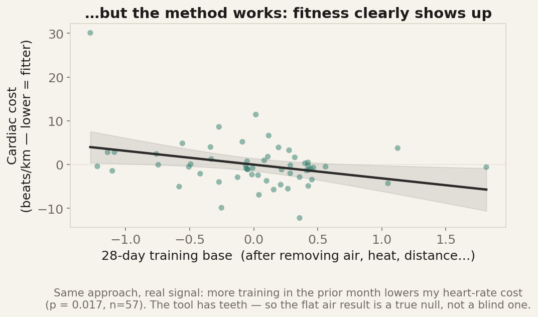
This is the same approach pointed at fitness instead of air. The more I'd trained in the previous month, the lower my heart-rate cost per kilometre — a clear, statistically strong slope (p < 0.02), in exactly the direction physiology predicts. More training, fitter, lower cost.
That's the result that makes the first chart trustworthy. The tool has teeth. It picks up a real bodily signal cleanly. So when it looks at air quality and sees nothing, that "nothing" is informative — it's a genuine null, not a blind one.
(A nice bonus: adding the fitness controls also made a spurious ozone "effect" from my first pass disappear entirely — confirming it had been a season-and-fitness artefact masquerading as an air signal. Exactly the kind of ghost this whole exercise is designed to exorcise.)
The catch that I can't control away
There's one more thing, and honesty demands I put it front and centre:
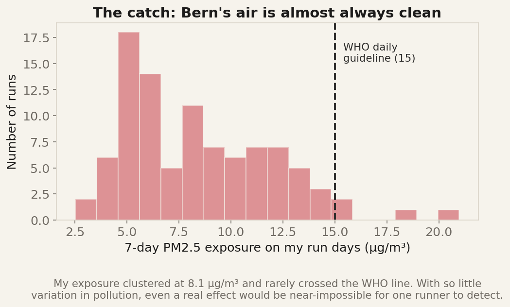
Bern's air is clean. Almost all my runs happened at PM2.5 levels well under the WHO guideline. To detect an effect of pollution, you need variation in pollution — and I barely had any. Even if dirty air genuinely slows runners, I'm a person who almost never runs in dirty air, so my own data was never going to be the place to prove it.
So the honest verdict isn't "air quality doesn't affect running." It's narrower and more truthful:
For me, running mostly in clean Swiss air, there is no detectable link between air quality and my running performance once heat, hills, fatigue and fitness are accounted for. And my data doesn't have the range to find one even if it exists.
Why I'm telling you about a null result
Because the null is the result, and most of what you read online would have sold you the opposite.
It would have been easy to write "Air pollution is silently wrecking your runs — here's the data." I had a draft of that, briefly, built on an ozone correlation that turned out to be a fitness mirage. The discipline of trying to disprove myself killed that story — and that's the point.
It also tells me something useful about what's worth building. A product that promises to predict your performance from your air, athlete by athlete, would be built on a signal that — for the large fraction of people living in clean-air cities — simply isn't strong enough to stand on. That's a feature that mostly tells people "no effect," dressed up as insight.
What does hold up is the boring, well-established stuff: pollution is genuinely bad for you when it's genuinely bad, the effects are cumulative over days, and the useful question on any given day is simpler than "how many seconds will this cost me." It's "is today a good day to be breathing hard outside?" — which you can answer from the air itself, without mining anyone's performance history.
That's the question Polly is actually built to help with. See your city's air now → — and decide for yourself whether it's a hard-run day or an easy one.
Method, briefly: ~95 easy/steady runs near Bern, 2022–2026, with grade-adjusted pace; ordinary least-squares regression with standardised predictors, air-exposure features (same-day, 7-day and 21-day rolling PM2.5 and ozone) tested against confounders (temperature, humidity, distance, elevation gain, 7- and 28-day training load, days since last run, and a time trend), multicollinearity checked via VIF. This is a single-person, observational analysis of my own data — a "does a signal even exist" check, not a clinical study. Air-quality history from Open-Meteo / CAMS. Done as statistical analysis of a personal export only.